An analytics dashboard should provide its users with the information they need quickly and clearly. Our visualisation expert Elena Danchyshyna has compiled 10 tips on what to consider when developing an analytics dashboard.
"A dashboard is a visual display of the most important information needed to achieve one or more objectives; consolidated and arranged on a single screen so the information can be monitored at a glance."
Stephen Few, Visual Business Intelligence Expert
An analytics dashboard is like a jigsaw puzzle. There are usually a number of different information and display methods, but each only shows a part of the whole picture. The task of a dashboard developer is to combine all these pieces according to their Meaning order. This step is necessary in order to gain the clearest possible view of things. This creates the basic prerequisite, visualised information to understand as quickly as possible.
We deal with the basics of visualisation in the blog article Data visualisation and the power of the visual.
Inhaltsverzeichnis
Basics for the development of an analytics dashboard.
To optimally organise an analytics dashboard, a specific Knowledge about the users helpful. Their roles and goals are as important as their intentions for using the analytics dashboard. These requirements should underlie and shape the dashboard design. In addition, however, the organisation's existing experience in information presentation and organisation should also be taken into account.
In the following, I present the most important aspects and their relevance in the context of the Development from Analytics dashboards in front of you. In the course of this, I will also give you helpful Practical tips with the hand.
Define the user groups for your Analytics dashboard.
The development of a coherent analytics dashboard is based on an understanding of the user. Depending on the use of an analytics dashboard, this can involve Power User from the Majority of the users. Power users engage much more intensively with the information presented.
Needs, for example from Managers and Experts, differ greatly. While an expert often needs a detailed view, it is usually sufficient for a manager to keep an eye on the most important KPIs. The choice of visualisation therefore depends on the user: For statisticians it is easy to read a boxplot. For managers, however, interpreting it can be a challenge.
User groups can be defined by Interviews define. This involves clarifying aspects such as the role of the employees in the company, their requirements for the analytics dashboard and a selection of information they would like to see in the display. This information then serves as the basis for the design process to evaluate which aspects to include and which to omit.
Tip 1: Use the information on power users to improve the implementation. However, be guided by the majority in the implementation to 80%.
Generate an understanding of data.
A central goal in dashboard development is therefore to meet the needs of the users as best as possible. That is why it is important that the dashboard developer understands the Data and the associated Information understands. It is particularly helpful when customers report on their everyday work and their daily challenges. This input helps the developer to optimally implement the requirements for an analytics dashboard.
For this purpose, requirements can be set out in so-called User Stories are collected. The customer tells us exactly what he needs, what he needs it for and in what form. In the process, the desired functionalities can be identified and implemented in concrete representation in the analytics dashboard.
Tip 2: Collect user stories from customers and have them explain them to you by means of an example in order to define the acceptance criteria together.
Pay attention to the structure of the analytics dashboard.
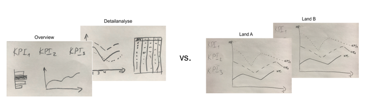
The importance of user groups also plays a major role in the structural design of the analytics dashboard. For heterogeneous user groups it is a common approach to use information "top-down" or "verticalThe "key figures" are presented in the table below. Thus, an overview of the most important KPIs is made possible at the beginning. This is followed by an overview of the subordinate units (so-called drill-down into the KPIs). Finally, the corresponding details are displayed. This has the advantage that each user group can jump directly to the relevant view.
For homogenous user groups a different structure would be appropriate: "horizontal". In this set-up, a home page is created to which various units (e.g. areas, products, markets, etc.) are linked. This landing page offers the possibility to navigate through the pages. As a result, users should be able to find the relevant information quickly by navigating from the home page to the necessary information.
Tip 3: Ensure that the user does not have to navigate through many different pages to find information that is currently relevant to them.
Rule of thumb: Avoid the so-called "information overload" by not displaying more than 4 graphics on one page.
Select the appropriate visualisation.
The primary function of the Visualisation is to convey knowledge, information and messages. A graphic should be readable and easy to understand for the user. If a user cannot read or interpret the graphic, he cannot perceive the information it contains. The more time a user needs to interpret the graphic, the higher the probability that misunderstandings will arise or that information will not be accepted. For this reason, it is essential to choose the right form of presentation for data.
Tip 4: Choose the form of presentation depending on the users and the information to be presented. Ask yourself: What do I want to convey with the visualisation? What do I want to get across?
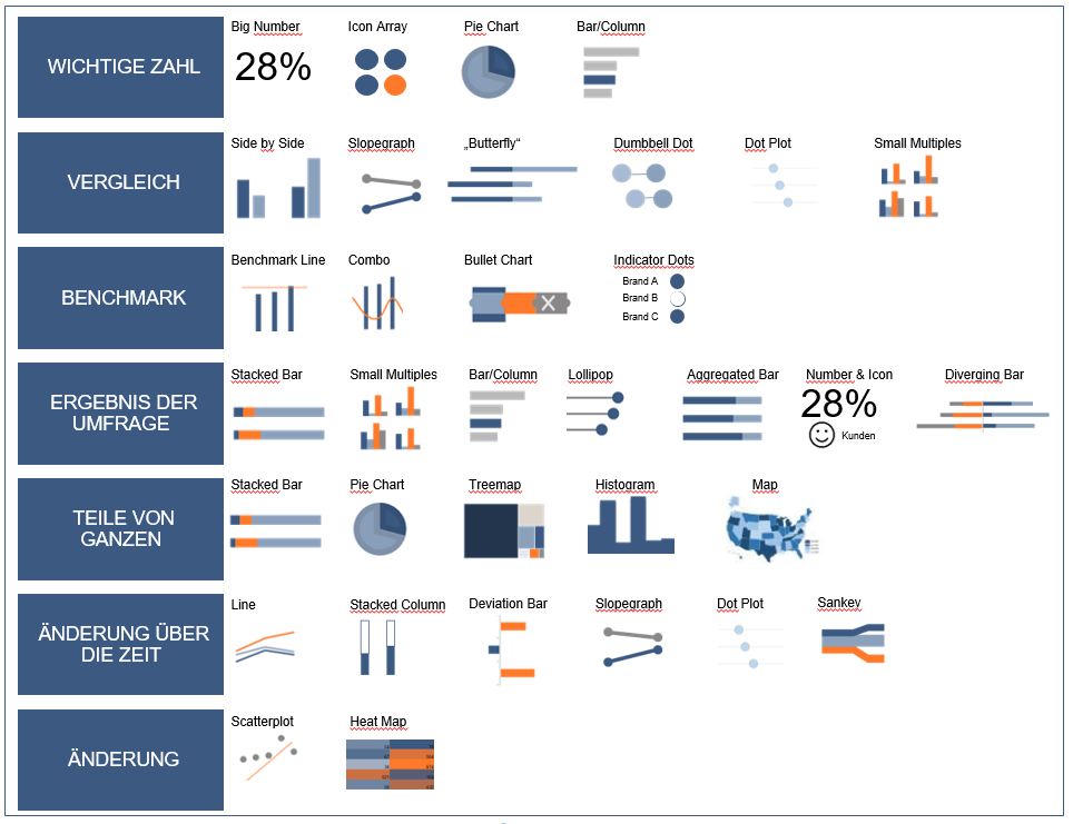
Recommendation: You can use a chart picker as a "first aid" for selecting the visualisation:
Don't forget the context.
Context is essential for understanding data. Stephen Few also emphasises the importance of the Context Any context that will help person viewing the dashboard determine whether or not action needs to be taken should be included. Only the context enables the clear interpretation when two or more values are available for selection.
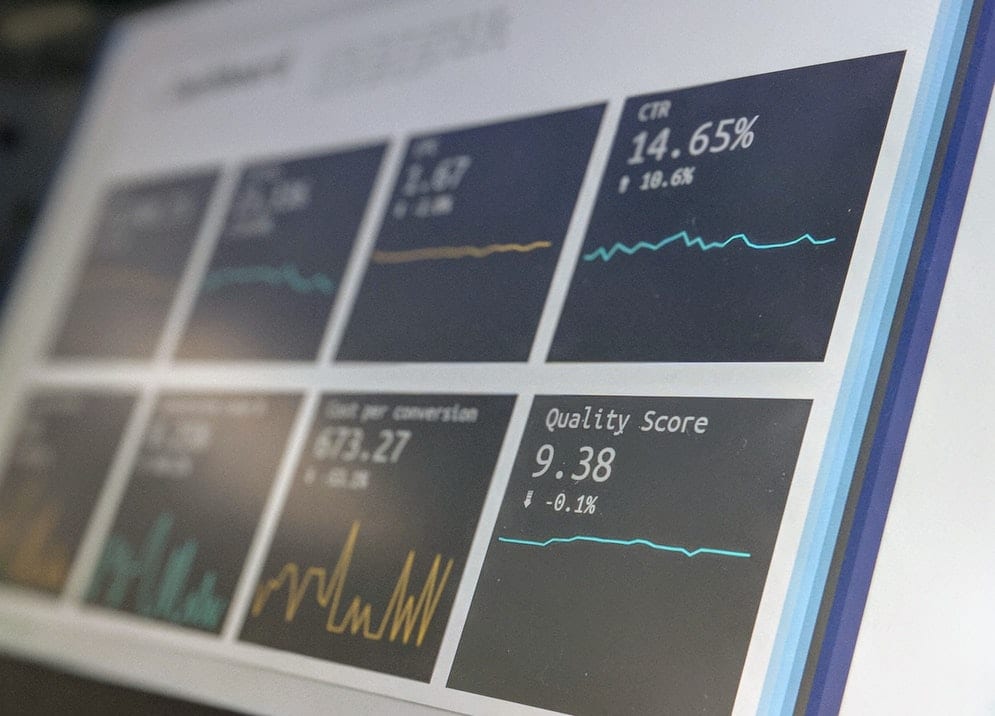
With the context, the user gets a Overview about the status and development of the data. In this way, decisions for action can be derived and transparency created. Typical variants of contextual data are the comparison of target and actual values or the comparison to previous periods as well as benchmarks. Contextual measures used include colours, sparklines or bullet charts.
Tip 5: Increase the information content in the dashboard by using comparisons, benchmarks and the development of data or combine historical data with actual and target values.
Highlight the message.
As already indicated, visualisations are a means of communication that convey a message. This means that visualisations should say something both as a whole and in individual components. Messages in this sense can be explanations (e.g. description of a graphic in the header), consequences, recommendations, labels or other statement forms. Each message should contribute to the readability and interactivity of the Analytics Dashboard. Thus, a graphic should answer a question and thus support the message to be communicated.
Tip 6: Use labels, introductions, explanations, recommendations and help boxes to clarify or reinforce statements made by graphics.
Think about consistency (look and feel).
Consistency is an enormously important aspect of user interface (UI) design, which is why it is mentioned high up in many lists on design guidelines. It is important to have a clear Style to have. Starting with the colour code, through fonts and panel sizes (if applied), to the frame and other graphic elements. Using a consistent style for text labels, functions, icons and display methods for similar tasks reduces the amount of learning the user has to do to grasp messages. This saves time and nerves, and improves the User experience.
This conclusion was also reached by Stephen Few, who explained: "Consistency allows viewers to use the same perceptual strategy to interpret the data, which saves time and energy".
Tip 7: Remember the saying, "if it is hard to see, it hard to read". Therefore, use colours sparingly and pay attention to recognition in the dashboard.
Use principles of information hierarchy.
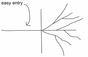
Information hierarchy principles allow users to see exactly what they want to see first. This is very important in the accelerated world of work, as people need quick access to important information. According to Google, websites lose 53% of readers because the landing page is "difficult to read" or cluttered. Therefore, it is important to have a "easy entry" into the Analytics dashboard and successively expand it with additional information.
Tip 8: Create an "easy entry" with structured and clearly defined information. Deepen the information content as needed when using the available functions (e.g. grouping, drill-down, etc.).
Maximise the data-to-ink ratio.
A good visualisation is characterised by being simple and clearly readable. All visual elements that do not contain relevant information distract the eye and obscure the essential. In 1988, the information scientist and graphic designer Edward Tufte introduced the concept of "Data ink" before. The data ink was used to designate those parts of the visualisation that contain information.
The data ink ratio of a visualisation is composed of the part with Information content and the part that contains no or no relevant information. "Above all else show the data. (E. Tufte). Tufte thus points out that a good visualisation consists at best of informative presentation - without ornamental but meaningless accessories.
Tip 9: Avoid any decorative elements or effects in visual presentations and use the "data ink" only to convey and evaluate really relevant information. As unimportant information or design elements distract the eye from the essential.
Tell a story.
Data in analytics dashboards tells a story. Stories have the power to intrigue us and point us to facts. At the same time, they give them a structure and make them easier to understand. The best way to tell the story is to use an example. A typical User behaviour for example, can be played back and populated with data across all touchpoints. Framing data in a story improves communication with the user group and their involvement in the question.
Tip 10: Tell a story with the data, ideally using a live example. It is always helpful to first develop a storyboard with keywords using a white board, post-its or on paper.
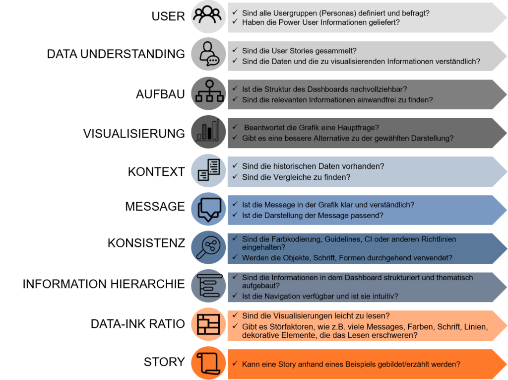
Checklist for the Viz Developer
The development of analytics dashboards is often based on the subjective opinion of the developer. The following checklist, based on our tips, is intended to help maintain objectivity during implementation.


0 Kommentare