
Data visualisations are a powerful tool. Hardly anything convinces us as quickly as a glance at a chart or a diagram. In this blog article, we take a comprehensive look at the most important aspects and requirements of data visualisations.
It is not a matter of course that we Data and analysis results in the form of data visualisations. Data analyses are usually abstract and it is not uncommon for the most valuable results to be in the form of relatively obscure Excel spreadsheets. In comparison, data visualisations have two advantages:
- The central statements and connections can usually be grasped in a few moments.
- We can trust what is presented because data visualisations are based on facts and figures.
Inhaltsverzeichnis
Teaching data analysis to non-IT professionals
The digital transformation in companies is increasingly leading to more and more non-IT specialists being confronted with data analyses. For example, analyses of target group-specific purchasing behaviour or regional purchasing patterns are an important basis for purchasing or personnel planning. As the saying goes:
"The right picture is worth a thousand words."
Since from Data visualisations depends in part on today, they must of course not only be easy to read, but the underlying data must above all be correct and plausible. In other words: The Data quality must be high. This is the only way to ensure that data visualisations have a resilient basis for far-reaching Decisions are.
Link tip: Data quality is one of the central challenges in companies. In our blog article, we have compiled five measures for optimal data quality. Data quality compiled.
Requirements and rules for data visualisations
The key requirements and rules for data visualisations serve to ensure clear communication. Since the Visual part of the communication is of such enormous importance, the corresponding demands on it are high. Data visualisations must follow just as strict rules as the language, where grammar, spelling and logical structuring are important for comprehension.
Prof. Rolf Hichert, expert for visual communication, has Rules for data visualisations set up. A successful presentation is based on seven rules:
- SAY
- UNIFY
- CONDENSE
- CHECK
- ENABLE
- SIMPLIFY
- STRUCTURE
The 7 rules for data visualisations
Data visualisations must have a clear message have, uniform presentation rules follow as well as Simple and quick to grasp be. At the same time, the visualisations must have a high Information density to avoid reducing the complexity of the issues too much and still focus on the essentials. Data visualisations must also concrete options for action point out, so that the interpretation does not depend too much on subjective factors or the content is irrelevant.
Reading tip: From theory to practice: Here, our expert Elena Danchyshyna writes how to achieve the perfect Dashboard and which 10 tips are useful when developing a Analytics dashboards help.
Neurological, psychological and cultural aspects of data visualisations
Visualisations are a fascinating and powerful thing. Alone because of the Neurological predisposition of the human being, images and graphics are an important component in the Information dissemination depicted. We retain about 80 per cent of what we are shown visually. With what we read, it's only 20 per cent, and with what we hear, only 10 per cent.
Also the Psychology must not be disregarded in pictorial representations. Peaked angles, steeply rising curves or certain striking colours can lead to a perception that does not exactly match the Data findings agree. Here there is a danger - consciously or unconsciously - of Distorting messages. This realisation is important for developers and users alike.
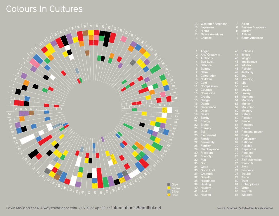
In the case of colours, there is another factor that must be taken into account, especially in an international and global context. This is because the meaning of colours is culturally dependent and in some cases has very different imprints.
In German culture, for example, the colour red is perceived as a warning colour. In China, on the other hand, red has a positive connotation and is associated with success and warmth. The following illustration shows how large the Spectrum of different attributions of meaning is:
Challenges in the visualisation of data
Also due to other external circumstances, there may be Distortions and to Misinterpretations come with data visualisations. Simply because there are fewer standards and much less practice in interpreting visualisations than in interpreting texts.
But mere external circumstances can also influence the evaluation of a graphic representation: even the format of the display on which a diagram is shown can change the interpretation. On a smartphone, the x-axis is automatically shortened so that curves showing a development can look much more dramatic. In comparison, a chart on a laptop screen would have a more expansive x-axis and appear less dramatic.
Likewise important is the Contextin which data visualisations are embedded. As data visualisations are always created with a specific purpose - usually to persuade about a certain issue - it is important to make sure that there is no conscious or unconscious manipulation.
When the context is complex, a single visualisation cannot represent the only truth. This is one of the reasons why we at Alexander Thamm GmbH rely on interactive dashboards set. While there may be limitations with individual data visualisations, an interactive dashboard incorporates various aspects of an issue. This minimises typical sources of error in the presentation.
Data visualisation as a driver of digital transformation
Especially in situations where, for example, managers have to make decisions quickly, there is no time for long and detailed data evaluations. Data visualisations help here because they provide - in the best case in real time - an overview at a glance of the relevant key insights can deliver.
A dashboard has the advantage of making everything visible at a glance and at the same time providing context. Data visualisations are also very suitable for summarising and presenting the results of complex projects, especially to the management. Therefore, this is also the last step in our data compass.
Properly prepared, data visualisations can also be read by non-IT experts. Because they thus significantly facilitate the integration of data science in companies, they represent a Valuable instrument of data-driven projects They are a key to the digital transformation of companies. They are thus a key to the digital transformation of companies because they can have an effect in many areas of a company.
3 approaches for good Big Data data visualisation
However, the problem of visualising big data is not new. Research has already been conducted on this topic in academia and methods and possibilities have been developed to visualise and navigate through Big Data. In overview, they can be summarised in three categories:
- Data reduction
- aggregated visualisation techniques
- advanced interaction possibilities
APPROACH 1: DATA REDUCTION
Data reduction includes the Reduction of the amount of data and the dimensions or attributes. If we think of a data table, the former refers to the reduction of rows and the latter to the reduction of columns. Methods of data reduction include Sampling methods with the help of which subsets of the data and filters are formed.
Dimensional reduction is carried out with the help of special procedures, such as the Principal component analysiswhich calculates particularly meaningful dimensions. Both data reduction and dimension reduction reduce the size of the data set so that correlations can be recognised in the visualisation. However, data reduction also involves the risk of information loss.
APPROACH 2: AGGREGATED VISUALISATION TECHNIQUES
Aggregated visualisations Summarise data points in the plot. An aggregated scatter plot represents e.g. clusters of points instead of each individual point. The density of the points is represented by the colour tone. An example of this is the Smart Data Compression of Qlik Sense.
Furthermore, aggregated visualisations can multiple resolutions include. Relevant data (e.g. current data) can be shown in high resolution in the centre, whereas less relevant data (e.g. the data from five years ago) are shown aggregated in the margin. In this way, overlapping can be avoided and the Focus on relevant data be relocated. With the help of data reduction and aggregation, the visual overlap is reduced and large amounts of data can be displayed again.
APPROACH 3: ADVANCED INTERACTION OPTIONS
Focus and context can be defined by Interactions be improved. In addition to zoom and filter, magnifying techniques offer the possibility to look at individual data more closely and still maintain an overview. Magnification techniques are distortion techniques, which also include bifocal displays and perspective walls. All distortion techniques move a selected data excerpt into focus, while the rest of the data set is displayed in reduced size.
Big Data data visualisation in existing visualisation tools
Qlik Sense, Tableau or Microsoft Power BI already implement these techniques in part. Zooming and filtering have become standard in these tools, but some options are also offered in the area of data reduction. These include aggregated dimensions and the integration of R scripts.
Aggregated visualisations, however, are only available via extensions, so-called Extensions, is made possible. For these extensions, popular programming languages such as JavaScript and R are used. In Qlik Sense, customised visualisations can be created using JavaScript, whereas Tableau offers extended possibilities for data reduction with R scripts. Power BI allows the integration of JavaScript as well as R scripts.
Even though there is not yet a tool that integrates all of the methods presented for data visualisation of Big Data, it is still possible to implement these methods with the necessary programming skills. Data visualisation of Big Data is still a developing field with a lot of potential - however, there are first advances that are also visible in visualisation tools.


0 Kommentare