Principles of Data Visualization
What Makes a Good Data Visualization - and why Tables Don’t Count
- Published:
- Author: Dr. Kathrin Guckes
- Category: Deep Dive
Table of Contents

After reading the headline you might think: Why is this relevant? Why should I care about that? You may be used to working with Excel and thus with tables – even with large ones. Visualizations might be something for presentations.
I get your opinion, and I understand where it comes from. But I can assure you: visualizations have unique powers that make them indispensable to data analysis and data presentations. Throughout my work as a PhD-student and later as a data visualization expert at [at], I have specifically come to appreciate their ability to show patterns. This ability is why, in data analysis, visualizations should be the centerpiece, supported by tables, rather than the other way around, as is often the case.
This Blog Post explores the unique power of data visualization and takes a closer look at the tole tables should play in complementing visuals in data analysis.
The Anscombe Quartet
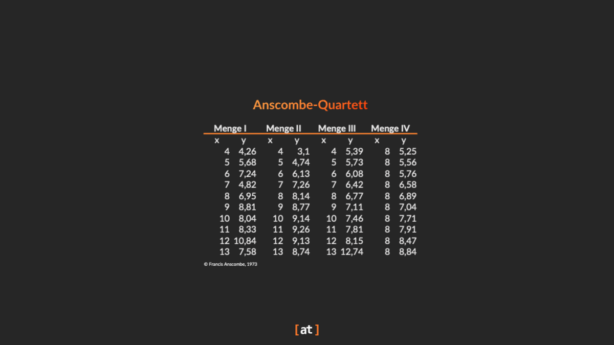
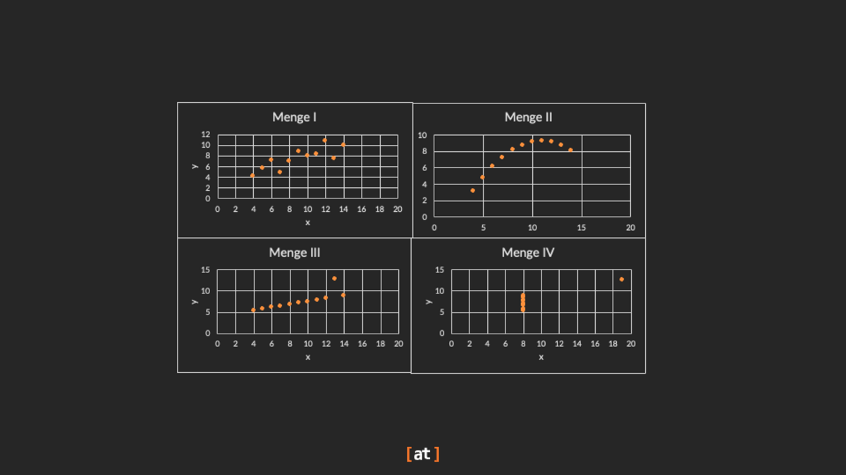
When statistician Francis Anscombe introduced the Anscombe Quartet in 1973, his goal was to show that datasets with nearly identical statistical properties, such as mean, variance, and correlation, can still look different when plotted. With this work, Anscombe challenged analysts to move beyond relying solely on summary statistics and instead make visualization an essential part of data analysis. The Anscombe Quartet (see Table/Figure 1) consists of four datasets, each with 11 pairs of x- and y-values. Despite having almost identical statistical characteristics, their visual representations reveal very different patterns. Anscombe’s work underscored the importance of graphical analysis and highlighted how outliers or unusual data distributions can significantly affect interpretation (Anscombe, 1973).
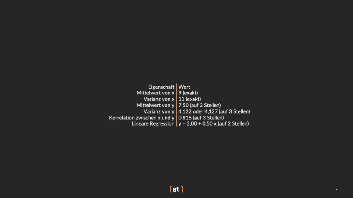
The four data sets have the following descriptive statistical properties:
The scatter plot for set I suggest a linear relationship between the two variables x and y. The scatter plot for set II suggests some relationship between the two variables. However, this relationship is definitely not linear. The third scatter plot (set III) shows a linear relationship with one outlier, while in the scatter plot for set IV, the data points are relatively close together, except for one outlier.
Nothing of that is apparent in the descriptive statistics of the four two-dimensional sets, and it is even harder to see these patterns in the data table showing Anscombe's quartet (cf. Table 1).
Anscombe’s demonstration and message remain highly relevant today. His quartet is still a powerful reminder to look beyond summary statistics and visualize data before drawing conclusions. Many modern data visualization researchers build on Anscombe’s messages, as shown by Matejka and Fitzmaurice (scatter plots) (Matejka and Fitzmaurice, 2017) and Chen et al. (network visualizations) (Chen et al., 2021) on generating datasets which have the same statistics but different visual patterns.
So, you may ask yourself again: Why cannot a table show these patterns? The answer is simple: A table is no data visualization.
Why a Table is not a Data Visualization
A table, despite containing valuable information, is typically not considered a form of data visualization. By definition, data visualization involves using graphical representations, such as charts, graphs, plots, or maps, to reveal insights and patterns visually (Few, 2009). A table primarily lists numerical or textual information in rows and columns but does not utilize visual encodings or graphical elements.
Consequently, the central reasons for why tables are no data visualizations are:
Lack of Visual Encoding
A crucial reason why tables are excluded from data visualizations is their minimal use of visual encoding. Visual encodings refer to the graphical representation of data points through elements such as position, size, shape, and color (Ware, 2012). Unlike charts or graphs, tables rarely employ visual encodings, making it harder for users to quickly perceive and interpret data.
Difficulty in Identifying Patterns
Tables require viewers to read and mentally process individual numeric or textual values to identify trends, correlations, and anomalies. This cognitive load contrasts with visualizations, where graphical representations instantly reveal underlying relationships and trends (Card, Mackinlay & Shneiderman, 1999).
Limited Use of Spatial Representation
Spatial arrangement is a powerful tool for showing relationships among data points (Tufte, 2001). While visualizations leverage spatial positioning to enhance comprehension, tables typically present data in rigid rows and columns, offering limited spatial context.
Stuart Card's Visualization Pipeline
To better understand why tables are not classified as data visualization, consider Stuart Card's visualization pipeline (cf. Figure 2), which outlines the systematic process of converting raw data into actionable insights (Card, Mackinlay & Shneiderman, 1999):
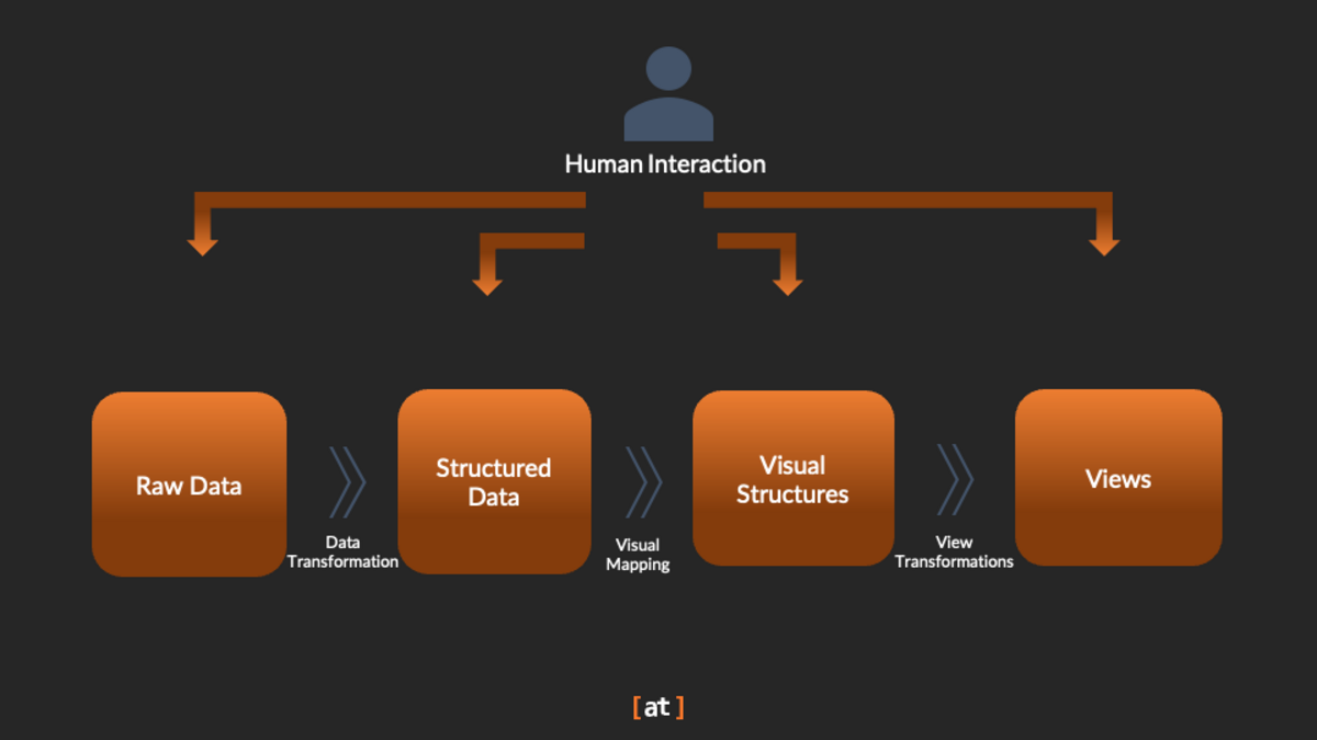
The initial stage involves gathering raw data from various sources. Via data transformation techniques, the raw data becomes structured data of a certain data quality. Data transformation includes filtering data, aggregating data, or replacing of missing values. Tables fit well into this step, as they can effectively store structured information because of their row-column-structure. Each row can represent a certain entity, such as a car, and each column can represent a certain key performance indicator, such as a certain sensor.
In the visual structuring stage, where table columns are turned into visuals, it becomes clear why a table alone does not classify as data visualization. Tables employ no visual mapping. They represent the data in textual or numeric form. As such, tables cannot depict patterns like data visualizations can and, consequently, they increase the cognitive load for the human.
The next step, view transformation, enables users to interactively explore visualized data, adjusting perspectives or detail levels. Tables rarely support such interactivity effectively because they inherently lack graphical components and visual flexibility.
The final stage, interpretation, is interpreting visual patterns and deriving actionable insights from visual representations. Tables hinder rapid interpretation by requiring individual examination of values, contrasting sharply with graphical visualizations that reveal patterns instantly.
Enrichments of Data Tables
There are various methods to enrich the classic table and thus to bring in some of the advantages that are otherwise only available through visualizations into a table.
In-Cell Charts (sparklines, bars, bullets)
Tiny charts inside cells add so-called preattentive encodings (position/length) that speed comparison without leaving the tabular context. This builds on Cleveland & McGill’s (1985) ranking of visual encodings and Tufte’s (2006) concept of “word-sized graphics.” Rao & Card’s Table Lens (1994) is a classic model combining tables with in-cell bars for better pattern detection.
Heatmap-Style Cell Shading & Conditional Formatting
Selective color highlighting reduces search time in tables. Wu & Yuan (2003) showed color was the most effective highlighting method for table search. Palette design, however, matters: Molina López et al. (2023) found that perceptual differences in heatmap color schemes strongly affect accuracy and speed.
Icons and Pictographs for Categorical Cues (ISOTYPE-style)
Small, meaningful icons can aid working memory and recall without harming accuracy. Bateman et al. (2010) and Borkin et al. (2013) showed that recognizable pictorial embellishments improve memorability in charts, which can extend to tables when used sparingly.
Row and Column Reordering & Grouping
Simply reordering rows and columns to cluster similar values (or sorting by a key metric) reveals structure. Behrisch et al. (2016) demonstrated that matrix reordering enhances perception of patterns in tabular and network data.
Focus and Context “Table Lens” Interactions
The Table Lens (Rao & Card, 1994) merges a table with in-cell bar glyphs plus a fisheye lens to keep labels readable while showing global patterns, improving visual search and outlier spotting in large datasets. To foster the context, sort or cluster rows, then add group headers(Rao & Card, 1994).
Explicit Labeling and Subtle Color Linkage
When tables are paired with text, labels (not just color) improve learning. Clinton et al. (2016) found that labels were more effective than color-only highlighting for probability tables, though the best results came from using both together.
Design for Perceptual Efficiency and Accessibility
Research consistently shows that encodings like position and length are more accurate than area or angle (Cleveland & McGill, 1985). Accessible palettes (Molina López et al., 2023) and testing for color-vision deficiency are key when applying heatmaps or shading.
Examples of Good Tables
To show practical examples of how the presented best practices improve tables, we picked two we at [at] developed in customer projects (cf. Figure 3). The table in the back is more of a classic table. Here, we paid special attention to the initial column order and the interaction to show or hide columns and vary their width. Further, we worked with icons. The circular icons are to be highlighted. They represent work of progress. Not having started the task is represented by a thin black circle and the further along in percent the task gets the more the outer blue circle outline gets filled up. The benefit of this icon is that there is no need to read numbers and mentally process them. It directly gets apparent to the user that the first two tasks are at a 25 percent progress, and the third task is at 50 percent.
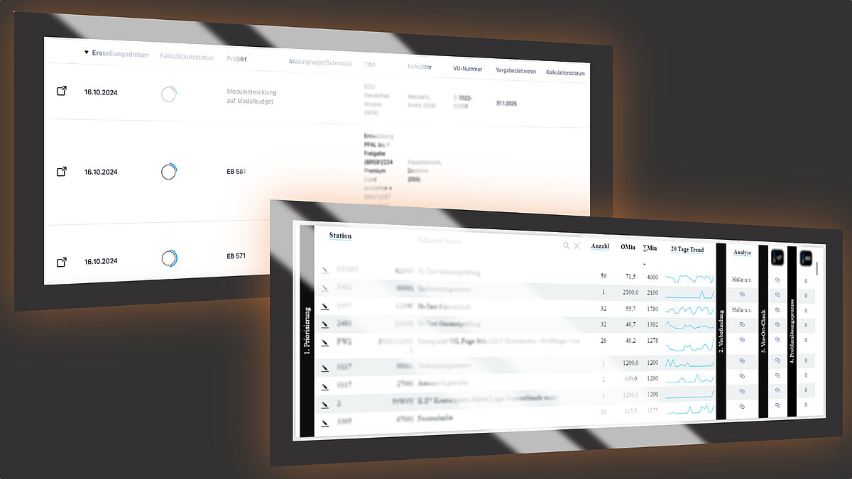
The table in the foreground also makes use of icons. But what dominantly influences this tables’ appearance is the grouping and the ordering of the table’s columns. The columns’ grouping via the black and white headlines represent a workflow the dashboard user shall complete. With these visual cues there is no risk that the user might confuse which information of which column is for which process step and how far along (s)he is in the process. The small line chart visually enhances the table and thus increases the memorability of the presented information. Furthermore, it is an option for the user to see time-based patterns which in a classic data table would not have been possible.
Conclusion
While tables are fundamental tools for data storage and presentation, they are distinct from data visualization, lacking the visual encoding and interactivity emphasized in Stuart Card's visualization pipeline (Card, Mackinlay & Shneiderman, 1999). Visualizations effectively transform data into intuitive visual insights, something traditional tables cannot readily accomplish.
References
- Card, S. K., Mackinlay, J. D., & Shneiderman, B. (1999). Readings in Information Visualization: Using Vision to Think. Morgan Kaufmann.
- Few, S. (2009). Now You See It: Simple Visualization Techniques for Quantitative Analysis. Analytics Press.
- Tufte, E. R. (2001). The Visual Display of Quantitative Information (2nd ed.). Graphics Press.
- Ware, C. (2012). Information Visualization: Perception for Design (3rd ed.). Morgan Kaufmann.
- Bateman, S. et al. (2010). Useful Junk? The Effects of Visual Embellishment on Comprehension and Memorability of Charts.
- Behrisch, M. et al. (2016). Matrix Reordering Methods for Table and Network Visualization.
- Borkin, M. A. et al. (2013). What Makes a Visualization Memorable?
- Card, S. K., Mackinlay, J. D., & Shneiderman, B. (1999). Readings in Information Visualization: Using Vision to Think.
- Cleveland, W. S., & McGill, R. (1985). Graphical Perception and Graphical Methods for Analyzing Scientific Data.
- Clinton, V. et al. (2016). Color Coding and Labeling Learning about Probability from a Table and Text.
- Molina López, E. et al. (2023). Effect of color palettes in heatmaps perception.
- Rao, R. & Card, S. K. (1994). The Table Lens: Merging Graphical and Symbolic Representations in an Interactive Focus+Context Visualization for Tabular Information.
- Tufte, E. R. (2006). Beautiful Evidence.
- Wu, J.-H. & Yuan, Y. (2003). Improving searching and reading performance: the effect of highlighting and text color coding.
- F. J. Anscombe: Graphs in Statistical Analysis. In: American Statistician. 27, Nr. 1, 1973, S. 17–21
- Same Stats, Different Graphs: Generating Datasets with Varied Appearance and Identical Statistics through Simulated Annealing, Justin Matejka, George Fitzmaurice, ACM SIGCHI Conference on Human Factors in Computing Systems 2017
- H. Chen, U. Soni, Y. Lu, V. Huroyan, R. Maciejewski and S. Kobourov, "Same Stats, Different Graphs: Exploring the Space of Graphs in Terms of Graph Properties," in IEEE Transactions on Visualization and Computer Graphics, vol. 27, no. 3, pp. 2056-2072, 1 March 2021, DOI: 10.1109/TVCG.2019.2946558.
Share this post:
