
Data visualisation and its precise analysis are central to the success of data-driven projects. These should be complete and free of contradictions. Dealing with strategies for data visualisations is an essential success factor in projects. This text presents strategies that can be used to optimally determine requirements in data science projects with a visualisation component.
Inhaltsverzeichnis
The stakeholders
Stakeholders are an important factor that influences the agility of the project and thus contributes to the success of the project. It can sometimes be demanding to implement all the requirements and wishes of the stakeholders and to respond to them.
This is especially the case when many stakeholders are involved in a project and they have different, possibly even controversial ideas about the final result. The various strategies that exist in this context will be illustrated in the following using a visualisation project as an example.
The project manager
Based on our many years of experience from over 1,000 data science projects with a visualisation component, various challenges have emerged and we have established appropriate procedures and strategies to meet them.
For such decision-making processes regarding the approach, we have developed a decision tree that helps to quickly structure and control the tasks. This starts with the first question concerning already existing DashboardsThe following table shows the different types of information, reports or other visualisations that can be made available for orientation purposes.
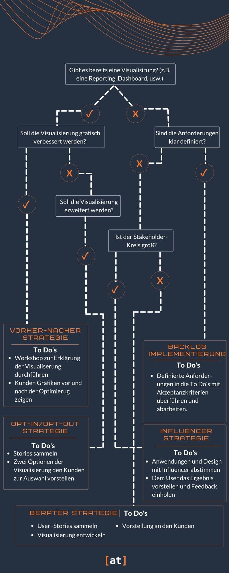
4 Strategies for Data Science Projects
1. before and after strategy
Situation: If a customer already has a visualisation - for example in the form of a reporting, as a PowerPoint or as an application with the dashboards integrated in various technologies such as QlikSense, Qlikview, Tableau, Power BI or similar - it must first be clarified whether this should be optimised or expanded. Recommendation: We have established the following approach for optimisation: We create First of all, a professional understanding of visualisations in a workshop. We clarify the purpose and goals as well as all components of the diagrams - including the meanings of the KPIs, dimensions and the exact question that should be answered with the visualisation. Based on this information, the diagrams are methodically developed according to established visualisation standards.
Presentation of results: Finally, we present the results to the clients by comparing the previous variant with the new one. We go into the implemented improvements and present our proposal.
Success Story #1: Analysis of reports according to the Success Rules (Hichert)
Optimisation of graphics according to Hichert's Success Rules increases the acceptance of reporting in lower and middle management.
Challenge
A renowned car manufacturer wants to increase the perception and acceptance of existing reports in management.
Procedure
A workshop is held on the content of the existing visualisations and the user stories are collected. The visualisations will be newly developed by Viz experts and presented in the workshop according to the before/after method.
Solution
A visualisation concept is developed in accordance with the Success Rules, in which uniform guidelines for the presentation of graphics are laid down.
Result
The visualisation concept according to the Success Rules is developed and the guidelines for the graphics are defined. The graphics are analysed and implemented in the visualisation concept. The acceptance and interpretability of the graphics has increased significantly in the lower and middle management circle.
2. opt-in/opt-out strategy
Situation: The situation is different if a visualisation already exists and is to be expanded. In this case, we recommend the opt-in/opt-out strategy. In the first place we collect the user stories. These reflect the workflow of the users and give a good overview of the real customer needs as a basis for the requirements in data science projects.
Recommendation: Based on the information collected, the user stories are converted into visualisations. For each visualisation, an alternative is also developed for selection.
Presentation of results: In an intermediate results workshop, we present the developed graphics with alternatives to the clients. We comment on the advantages and disadvantages of each variant and give our recommendation.
Success story #2: Conceptual development of reports according to IBCS
Provision of reports according to IBCS rules increases acceptance by the corresponding users
Challenge
A subsidiary wants to increase the acceptance of existing management reports and integrate the reports of the parent company.
Procedure
A workshop is held on the content of the existing visualisations and the user stories are collected. The visualisations are developed and presented in the workshop as a proposal from two options to choose from.
Solution
A visualisation concept according to the IBCS rules with reference to the "Success Rules according to Hichert" is developed. A feasibility analysis is then carried out and the concept is successfully implemented.
Results
The visualisation concept according to IBCS is developed and the guidelines for the graphics are defined ¨The user stories are analysed and the appropriate graphics are developed ¨The acceptance and interpretability of the graphics has increased in the upper management level.
3. influencer strategy
Situation: There are cases where our clients start from scratch and have no visualisation basis. The number of opinion leaders is then large, so it is not easy to respond to everyone's wishes and design vision.
Recommendation: One possible solution to this is to create a to find stakeholders whose influence on the project is decisive. is. In the intermediate votes, the visual developments should then be based on his or her ideas. This approach is known to us as the "influencer" strategy.
Presentation of resultsThe results are presented to the entire stakeholder group and discussed in terms of the benefits and innovations gained.
Success story #3: Analysis platform for parts cost management
Monitoring of the procurement process and supply of individual parts after series run-out in the
Aftersales area.
Challenge
A renowned automotive company wants to link and visualise various aftersales-specific data from purchasing and sales.
Procedure
A workshop is held with the product owner in which the user stories are collected. The visualisations are developed by experts and presented to the users and other stakeholders after coordination with the product owner.
Solution
Based on the diversified aftersales data sources, the data landscape is determined and interfaces are created. An interactive and flexible application with user-friendly visualisations is developed.
Result
Transparency of purchasing price trends and thus the achievement of an improved starting position in price negotiations. Development of a measurement and control variable for target measurement and control. Recognition and determination of the conspicuousness of additional costs in comparison to series discontinuation prices.
4. "Advisor" strategy
Situation: There are cases where it is not possible to find an influencer and yet several stakeholders need to be served in a project. The exact definition of requirements in data science projects can cost a lot of precious project time in these situations. The consequences are constant revision and resource-intensive processes.
Recommendation: For this case, our recommendation is to pursue the "consultant" strategy. In this case, all requirements in data science projects with the associated Acceptance criteria collected and jointly prioritisedt. The implementation is carried out by the visualisation experts and feedback is recorded during an interim vote.
Presentation of results: We present the final version of the visualisations and comment on the methodology used to create the visualisation.
Success story #4: Customer value analysis
For the sales management of a tool dealer, a prototypical, interactive tableau was developed.
Visualisation created.
Challenge
A German tool dealer has so far only an inflexible analysis that offers no comparison with other customers. The visualisation should be vivid, interactive and
still be detailed.
Procedure
In the workshop, the most important parameters for the presentation are defined together with the client. The experts develop the visualisation and it is then presented to the client using storytelling.
Solution
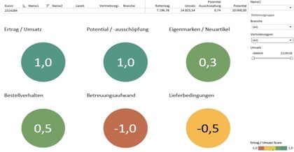
Based on the data available in SAP, the parameters were calculated and visualised in Tableau. Each parameter of a customer is given an easily understandable score, depending on the selected reference group.
Result
The visualisation makes it possible to quickly and easily see in which areas a client is performing in comparison to its reference group. All information from each client can be retrieved and compared with the reference group.
5. backlog processing
SituationThe last and simplest approach is backlog processing. When all the requirements in data science projects are clearly defined, there are no more discussions about them. Thus, a backlog (unfinished tasks in the project) is automatically defined and agreed with the clients.
Recommendation: Process the existing tasks successively in the sprints.
Presentation of resultsIn the final presentation, the requirements in the data science project are referred back to and their implementation is shown. This can happen dynamically in a software or statically in a PowerPoint.
Success story #5: Warranty KPI Dashboard
Comparability of market metrics in a management dashboard.
Challenge
A large car manufacturer wants to present the performance KPIs in a management dashboard. A formula for the measurability of the KPIs is to be determined.
Procedure
In a kick-off with the customer, the defined requirements are translated into user stories with acceptance criteria. The created backlog is processed according to SCRUM.
Solution
KPIs are calculated on the basis of a unified index. The visualisation is implemented in QlikView. The KPI value calculations are controlled via Excel files.
Result
Implementation of a prototype and release for
First test markets. Create a map representation to compare the KPIs.
Conclusion
Every data science project is unique. However, the path to an individual solution has structural similarities and recurring questions. The Data Compass is the answer to these commonalities and it helps, Accelerate, assess and optimise processes. Just as a real compass helps to navigate and makes it possible to be clear about one's own position, the data compass also provides orientation. Data science projects are highly complex and it is all the more important not to lose the overview. With the data compass we developed, we never lose sight of the goal - because we know: Only those who have the right orientation can break new ground.
In our experience, these strategies for defining and implementing requirements in data science projects offer comprehensive protection to ensure project success. In doing so, we look back on numerous use cases and correspondingly many experiences from which we have been able to learn.
In particular, the scenarios in which many stakeholders play a role are not only among the most frequent cases, but also among the most demanding. Those who enter the data science project with a strategy for the requirements have already gained a lot before the start.


0 Kommentare