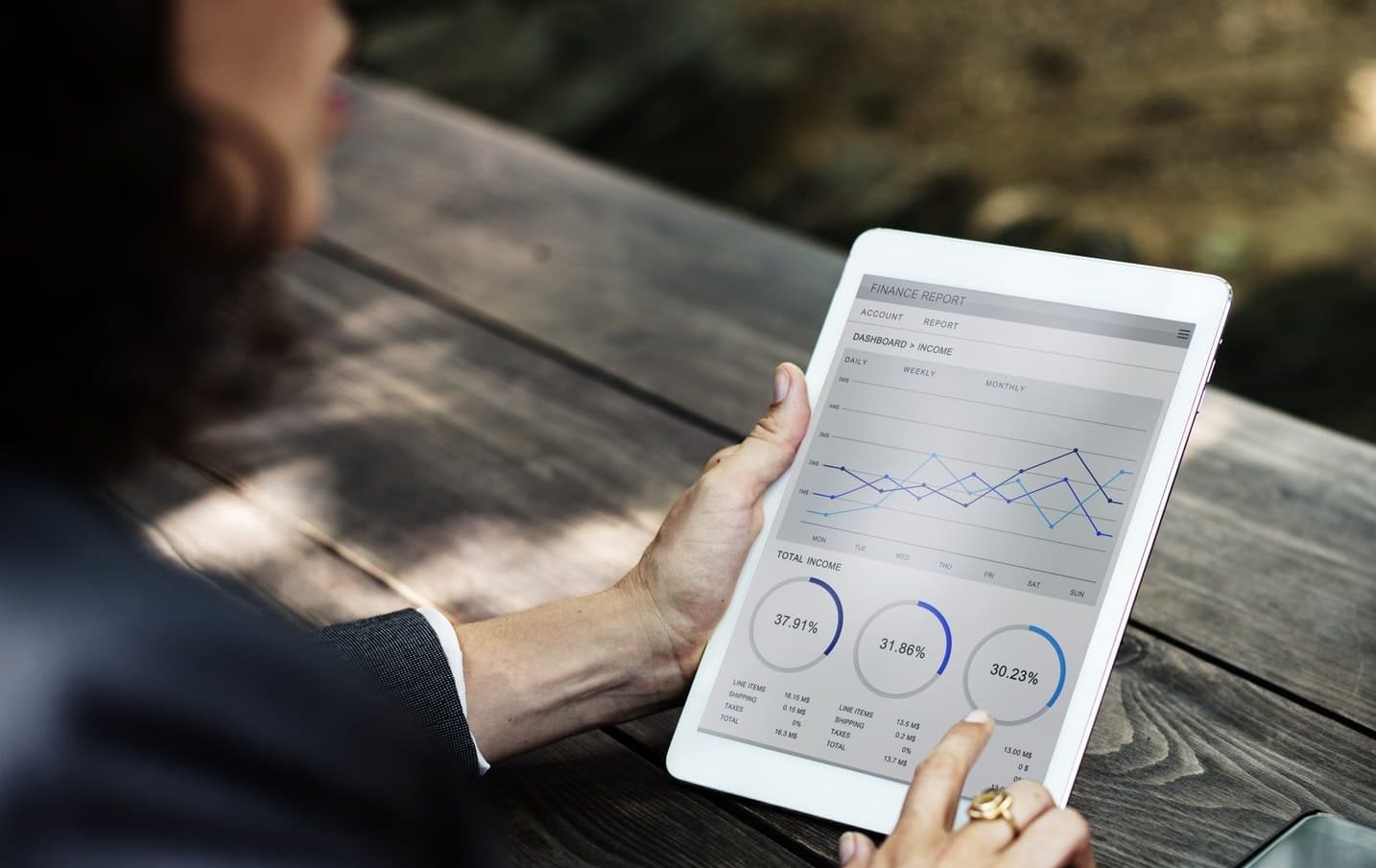
Communication is the key to project success. Through visualisations, for example in the form of a Dashboards, can Data Scientists communicate with customers or colleagues. In other words, the visualisations become the language. This language should be mastered by developers, customers and colleagues alike. That is why it is so important to develop easy-to-read visualisations. Because as the saying goes:
If you have something to say, don't say.... just show it.
Before outlining the 4 essential steps on the way to the perfect dashboard, it is first worth taking a short excursion into the world of the agile Project managementbecause there, the dashboard creation is part of the Data science projects usually located.
Link tip: In our article on Data visualisations the power of the visual in data projects is taken up in Data Science projects.
Inhaltsverzeichnis
The role of design thinking in data science projects
A data science project is characterised in particular by Agility off. In an agile environment, the processes around requirements analysis and implementation must be designed effectively. To ensure this, various agile project management methods such as SCRUM, Use Case Workshops or task boards are available.
Design thinking, user story mapping and kanban boards are also agile tools. In the everyday life of a data scientist, it is above all Design Thinking wide application.
Design thinking is often used in the requirements process of data science projects within the framework of a use case workshop at the beginning of a project. Within this requirements process, it is also decided when exactly and in what form a dashboard should be used. This is an important step, which involves a deeper understanding of the Customer needs and thus their solutions goes. Design thinking is an iterative process that supports the development of alternative strategies and solutions. The approach helps with this:
- Understanding the needs of the users precisely
- Question assumptions in order to solve problems that have arisen due to unclear definitions or were unknown in advance.
- Redefine issues that may not be immediately apparent with our initial level of understanding
The "generation effect
The close cooperation in workshops and the early, intensive involvement of the customers in the projects have positive effects. First and foremost, the relationship with the customers and the understanding of their needs benefits. With regard to dashboard creation, one speaks of the so-called Generation effect.
This is a phenomenon of information processing. Information that people work out independently is better remembered than information that is simply read passively.
The fact that customers can contribute their own ideas to the creation of a dashboard through sketches increases the acceptance of the results. In addition, relevant information is subsequently easier to find in the dashboard.
Furthermore, by involving all stakeholders, the approach covers the different aspects of the Requirements, a common Understanding of the challenges in the project as well as the full Transparency about the activities. Last but not least, projects also benefit from the Time saving through the few coordination loops, which is of great importance in agile project management.
Creation of a dashboard
In practice, it looks like this: In a one-day or half-day use case workshop, ideas, user stories and possible solutions are collected in cooperation with the customers. In a subsequent Brainstorming phase the customer can also present the ideas in graphic form. This gives us the first hand-drawn sketches that reflect the customer's wishes. These represent the first impulses for the later dashboard development.
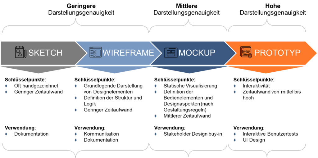
The data generated here User Stories tell short stories from the user's point of view that describe the desired functionality for the dashboard. They serve as a basis to define the requirements. To get a perfect dashboard, the following 4 steps are always necessary:
Step 1: The sketch
As a rule, the planning of a new dashboard begins with a hand-drawn sketch. Sometimes clients also bring ideas, wishes or graphic suggestions into the planning phase. This often happens in use-case workshops using the design thinking method to collect graphic ideas with the customers and then discuss them. On this basis, the following are then very quickly developed Sketches developed. These hand-drawn sketches, also called sketches, are then followed by the pixel-precise wireframe.
Favourite toolA biro and a sheet of paper.
Step 2: The wireframe
The wireframe is still a very simplified version of the later design. In the wireframe, the focus is on the positioning of the content elements in the later dashboard. This is where the structure of the dashboard is defined. For this reason, the perspective of the User experience take centre stage. In a Wireframe only the most necessary elements of a dashboard are shown. This is where it is decided on the basis of which aspects the subsequent division will take place:
- by products or user level (simple user vs. expert),
- by area (marketing vs. sales) or
- by markets (Germany vs. Spain)
The first thoughts on the Navigation in the dashboard are also made in the wireframe. However, design elements and individual functionalities do not yet play a role here. The main focus is on the structure and logic of the future dashboard.
With the aid of a wireframe, a sketchy description of the dashboard is created with representations of the Functions and of the Layouts. In this step, above all, the concept and its feasibility are checked.
Tool of my choiceA biro and a sheet of paper (sometimes Balsamiq, a rapid wireframing tool, is used).
Step 3: The mock-up
With a Mockup is a basic framework of controls that can be used to realise the optimal user flow. A user flow describes a series of tasks that a user must perform in the course of completing a process.
The mockup builds on the structure of the wireframe. However, other design aspects come into play:
- Colour
- Typography
- Images
- Graphic elements
The mockup shows the preliminary design of the planned application. A mockup is more detailed than a wireframe, but it is far from being a final version. It represents the visual design of a dashboard. Nevertheless, mockups are often used to gather feedback from stakeholders. This step is about a "Look and Feel of the future dashboard. The advantage: thanks to early feedback, the design does not have to be completely revised again later in the development process. This saves time, money and above all nerves.
Since the mockup is a basis for the Implementation it is advisable to programme only minor deviations into the prototype after the mockups have been agreed. The reason: far-reaching changes or deviations from the mock-up can jeopardise the verified feasibility.
Recommendation for the mock-up toolFigma or Sketch
Step 4: The prototype
Prototypes are accurate and detailed visualisations of the planned features or dashboard of an application. A prototype is characterised by Interactivity off. This is why the prototypes are often referred to as "click dummies". A prototype is created on the basis of a mockup. In contrast to a mockup, a prototype enables the simulation of user interaction with the dashboard.
A prototype looks very similar to the finished product and is an excellent tool to get user feedback and test the product before realisation. For this reason, it is important to develop a prototype relatively quickly. Agile methods are also essential here.
Recommendation for prototyping: Use available technologies. My experience refers to Qlikview, QlikSense, Tableau or Power BI.
Challenges in dashboard development
There are numerous programmes or software that support the process of creating a dashboard. It is also possible to draw everything by hand. The difficulty lies in optimal Software respectively Mode of operation to find. Since the number of potential technologies is very large, it is advisable to choose a tool that:
- requires little training time,
- has minimal or no costs, and
- quickly delivers results
However, it is always important that the result is presented clearly and understandably in each of the 4 steps.
In agile projects, there is often a tendency to shorten paths because time plays a significant role. Therefore, the first two steps are skipped and a mock-up is developed directly. This usually involves many coordination loops with the customers and leads to changes in the prototype at short notice. To avoid this, it is important to go through the entire process with all four steps.
This process helps the users to better visualise the end result. But this process also has advantages for the data scientist: All steps are discussed with the customer and approved as part of this process. This way, short-term changes on the way to the perfect dashboard can be reduced and at the same time all requirements are met in time.


0 Kommentare